Depaul UK’s new poster campaign is brilliant in its manipulation of many complex affects at once, pivoting primarily on its use of space. It asks the reader for an inordinate amount of attention when considered in relation to most modern forms of advertising, asks them to adopt two wildly different personas and then hits them with a call to action. It’s proof that advertising need not (really, should not) be merely quick, disposable and pleasurable to be effective.
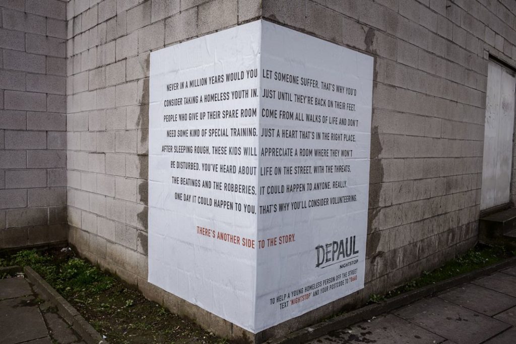
Depaul UK is part of an international charity devoted to fighting homelessness, especially youth homelessness. The ad campaign specifically highlights their Nightstop campaign, which provides emergency transportation and accommodation for homeless youth. Here’s the ad in full:
But here, likely, is how you would first experience it:
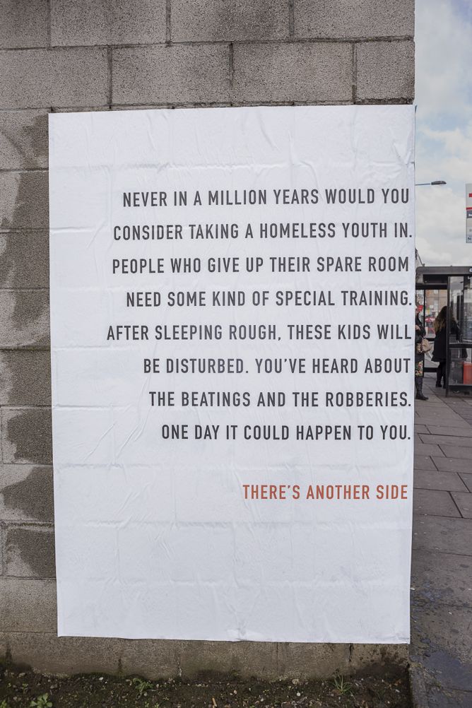
The text, all uppercase, black on a white background, is easily visible and the reader will probably start to work his or her way through it from a significant distance.
First, the hook: “Never in a million years would you consider taking a homeless youth in.”
Condescending, maybe, and cruel, but most readers would be forced to agree, even if they didn’t want to admit it. Instead of obscuring or arguing against the audience’s point of resistance, the ad invites identification with it. Especially with the next sentences:
“People who give up their spare room need some kind of special training. After sleeping rough, these kids will be disturbed. You’ve heard about the beatings and the robberies. One day it could happen to you.”
Don’t feel bad, the copy seems to say. These are valid excuses. Isn’t it too much to ask you to open up your home, at least without adequate preparation? Sure, the issue of homelessness is certainly a problem, but who made it your responsibility? Why should you put yourself in danger, or at the very least, discomfort? There are programs for those sorts of things with professionals at the helm – it’s a pretty big request for someone to ask you to open up your home to all sorts of unnecessary risks.
The ad, of course, turns on the fact that the reasonable reader will realize that this entire premise is absurd. Most likely, they do feel this way, or at least feel some discomfort with the idea of letting a homeless youth spend the night in their home even though they don’t have to. They’ve been successfully interpellated as a realist – callous, perhaps, but sensible, an identification that brings with it feelings of guilt, self-disgust but also resignation, the feeling that there’s no other way it could be.
But if they have half a brain in their heads, they’ll realize that the idea that someone would 1. Spend money to 2. Design and ad and 3. Put it all over London just to encourage people to be crueler to homeless youth is too bizarre to be true. They’re forced to enact their own resistance but invited to read on below:
“There’s another side.”
Ideally, the reader is a fast enough reader or a slow enough walker to hit this point before they come around the corner. After being forced into a position of guilty acceptance, they’re presented with the entire message:
“Never in a million years would you let someone suffer.”
You just need “a heart that’s in the right place.”
“One day it could happen to you. That’s why you’ll consider volunteering.”
“There’s another side to the story.”
Consider the effect if this message were the only message. It would speak to someone who, by most modern measures, we might consider saintly: someone who has made it their responsibility to offer what they can to alleviate the pains of homelessness, despite the perceived risks or discomforts. It would be a positive message, but to most, it would seem hopelessly idealistic.
When both messages are taken together, though, the effect is not one of saintly invocation but of everyday redemption. The reader has been patiently walked through and forced to reflect on the cruelty inherent in their supposed realism. Thus primed, they turn the corner and see the entire text of the ad. Not only is there a way to rescue themselves from the guilt they’ve been made to feel, but if the ad can be believed, it’s far from saintly: actually, it’s quite ordinary.
This ad, then, is brilliant for a few reasons. The first is not simply the clever use of space but the use of space to create temporality with a print ad. The use of physical space is for more than just the “wow” factor: it allows the reader time to inhabit a few different personas as they read the ad. First, they are the hard-nosed realist, swallowing their guilt; then, they’re given the chance to become redeemed in a way that’s made to seem easy and ordinary.
I’m always fascinated by ads which eschew pleasure and delight as their only goals. Delighting your audience is an easy thing to want to do but often the least effective message you can send. Delight alone asks for very little investment from the consumer.
This ad has a delightful finish, in the sense that it re-positions the reader as someone empowered and willing to give help and mercy to those in need. But it does so only after making them feel guilty, slimy and a bit helpless about the whole situation.
The campaign has inspired imitators which put the reader on the same affective roller coaster, like Jasmine Kay Uy’s “Art is Pointless…” installation:

The idea is the same: present the reader with what seems to be a depressing but realistic viewpoint that would be absurd for anyone to advertise. Then build them back up with an empowering, redeeming message.
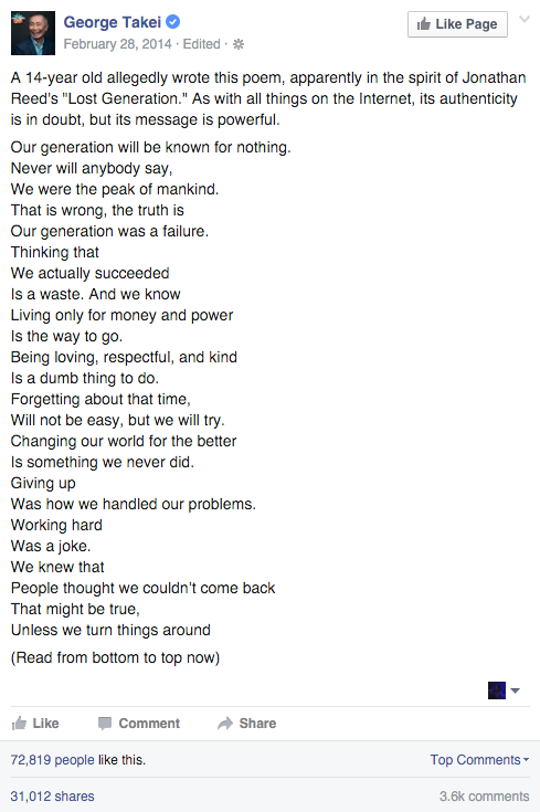
It’s also the same vibe as this breed of “backwards poems” that often go viral on Facebook:
Present the resistance to your message in a way that obscures your message; invite people to re-consume your message in a way that discounts the resistance you’ve already evoked. Pretty nifty, yeah?