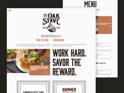
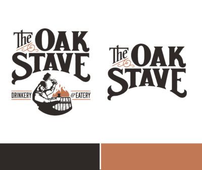
After naming the Oak Stave, the logo design needed to embody the symbolism of the premise of the name. The cooper and the barrel burning process were a no brainer. The hand lettering in the logo lockup adds the element of tradition, paired with a clean and crisp modern illustration. Muted colors avoid any idea of a flashy logo and keep it humble. By itself, a stave is nothing more than a piece of wood. But together, staves make the barrel strong. They don’t get the attention that the whiskey in the barrel does, but they don’t need it, either. The cooper’s workmanship is often invisible: a well-made barrel doesn’t leak. But his integrity is what makes the distilling process possible. honoring quiet integrity, quality and strength is what the oak stave is all about.